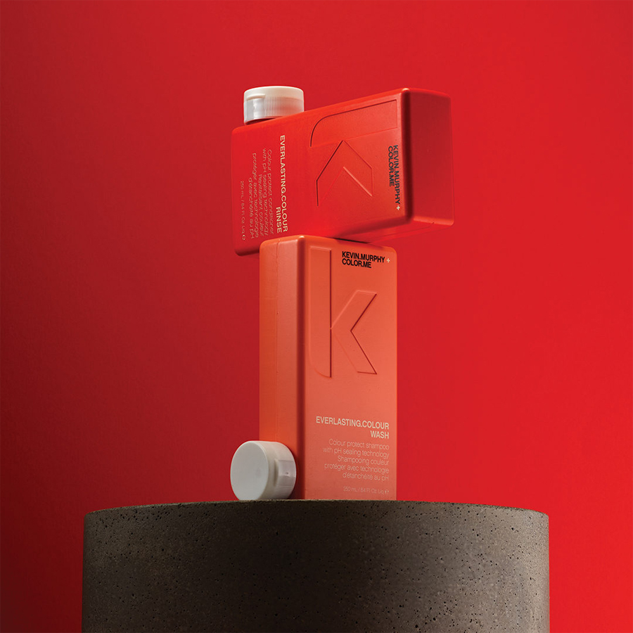
Australia is known for many things, its endlessly beautiful beaches, stunning corals and stellar weather. Although this all sounds majestic, sometimes, the effects of these ‘beachy’ activities can leave hair in a frail state. This is why Australian hair products have been made with so much thought in mind, they’ve gone through years and years of trial and error, both in terms of the content inside as well as the packaging and ease of use of bottles and sprays for the end consumer. Australian hair producers are truly aficionados when it comes to creating something that the customer is going to love.
A Touch of Australia
Australian hair product brands have learnt how to seamlessly integrate the look and feel of Australia and showcase this through the packaging. If you think about Australia, you think ‘sun-kissed’, ‘glowy’ and ‘natural’. This is exactly the feeling that these hair products want to show through their items.
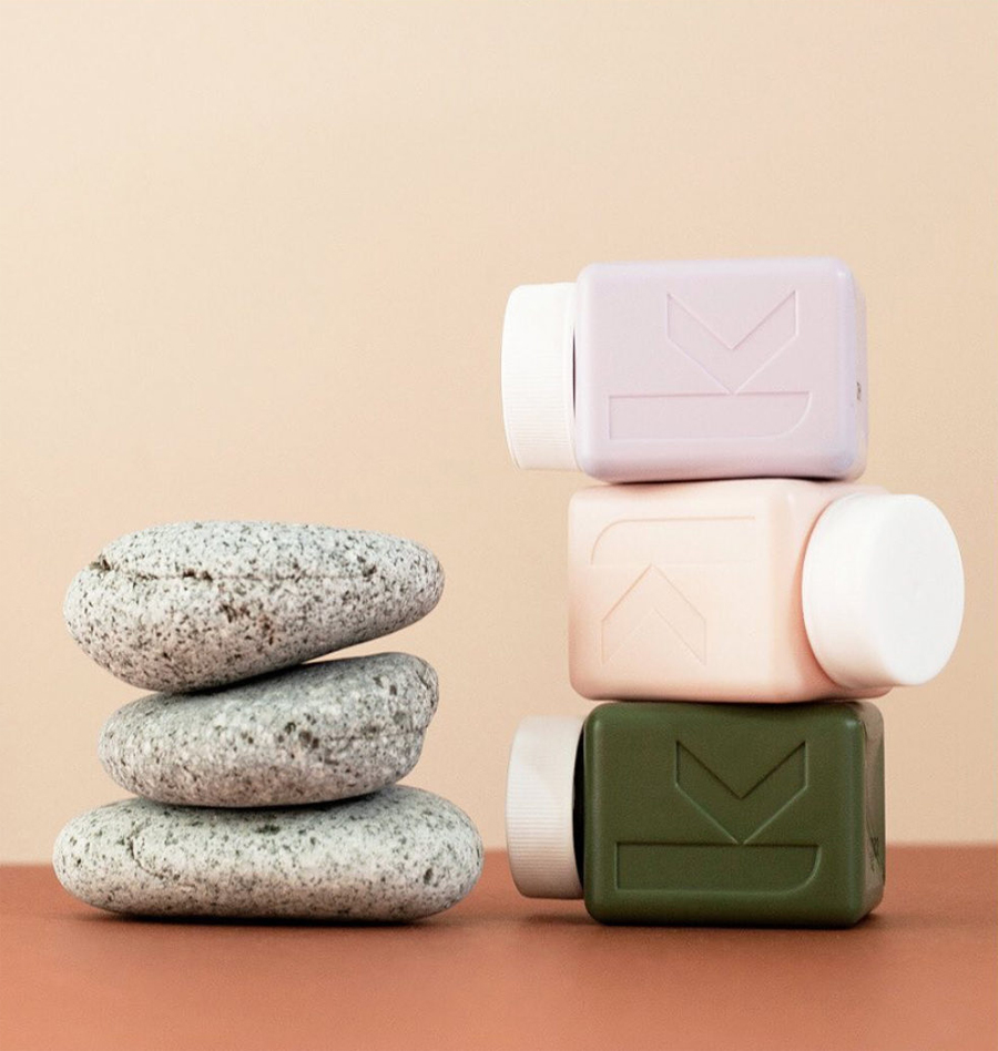
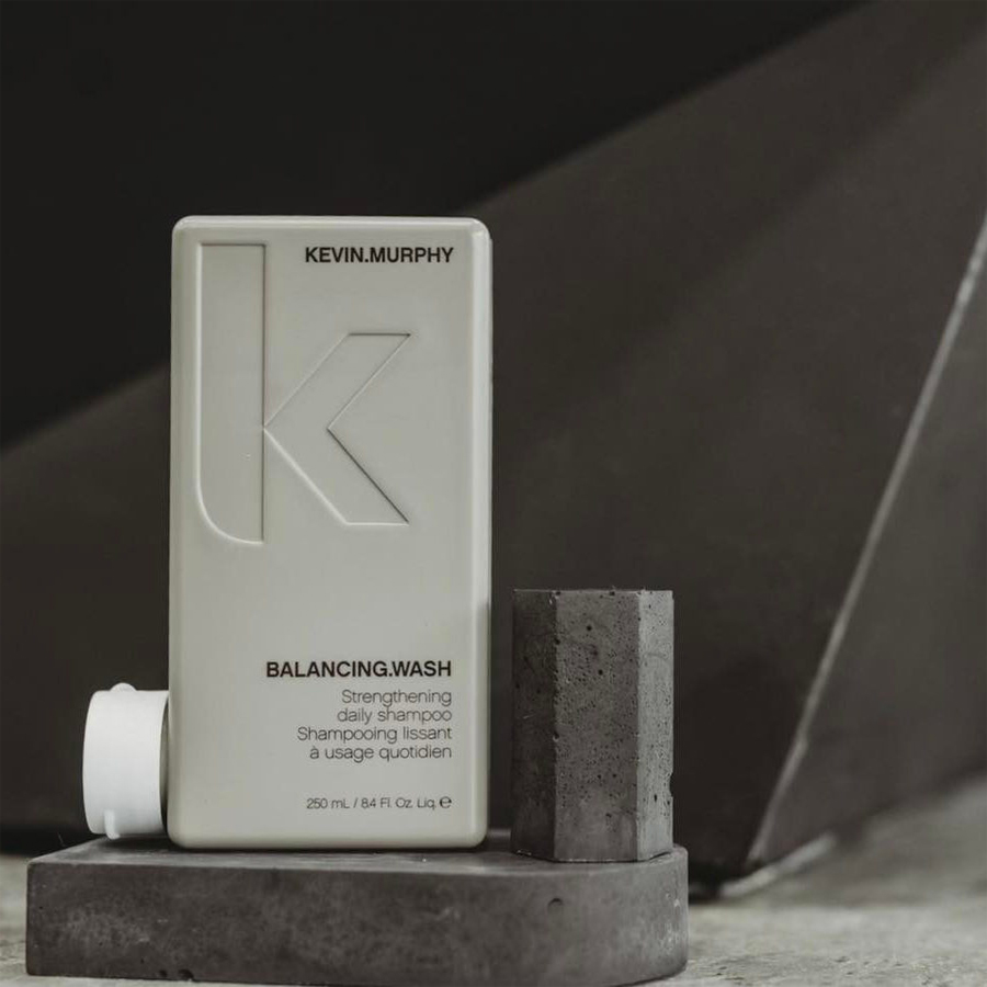
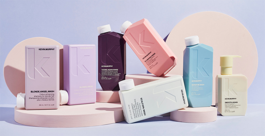
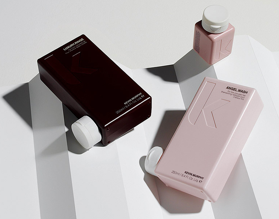
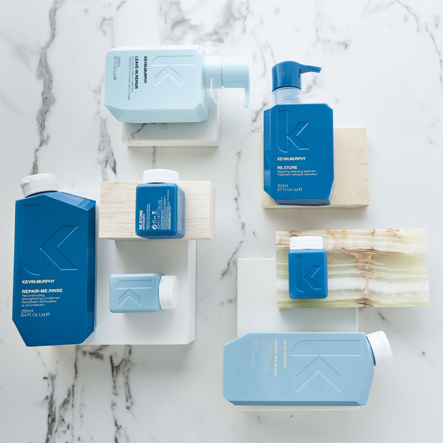
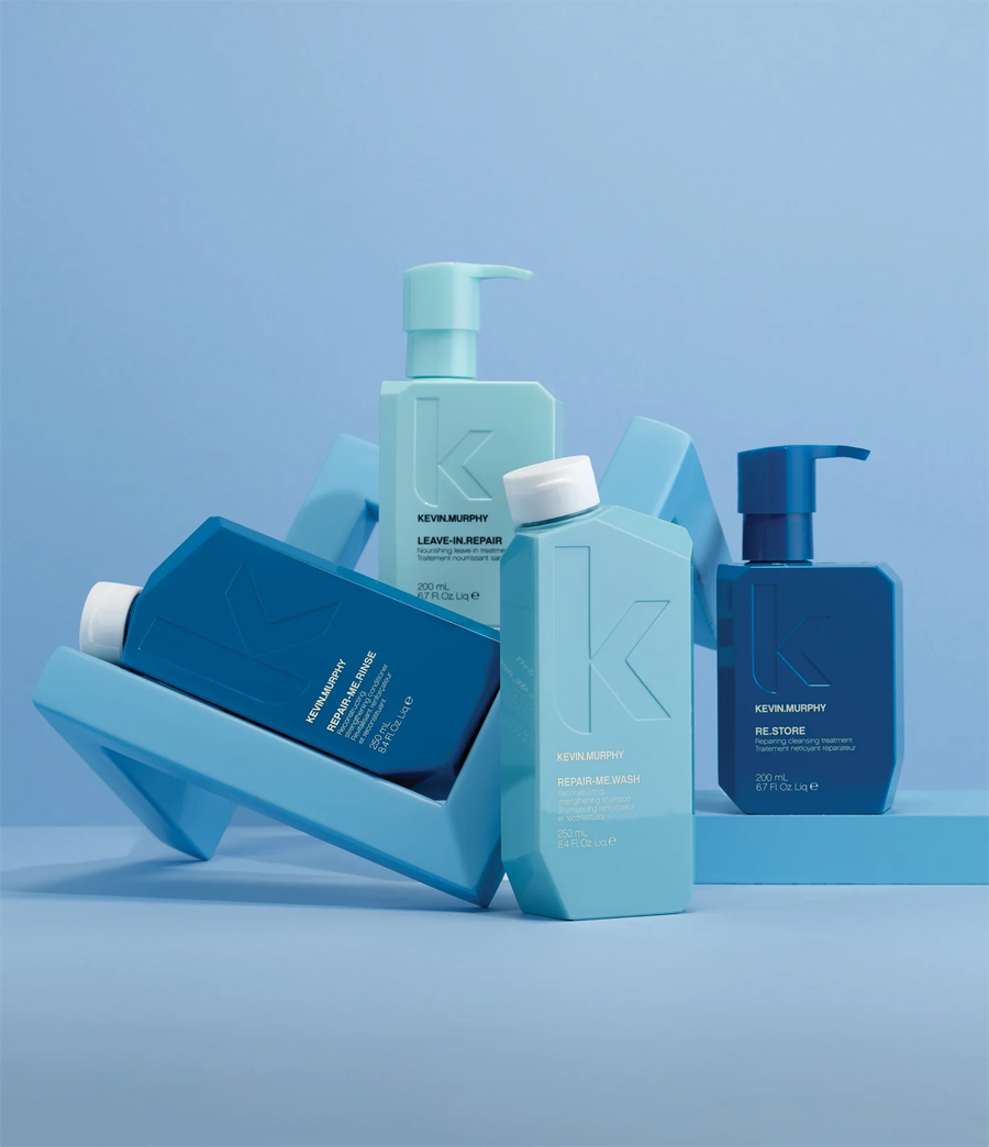
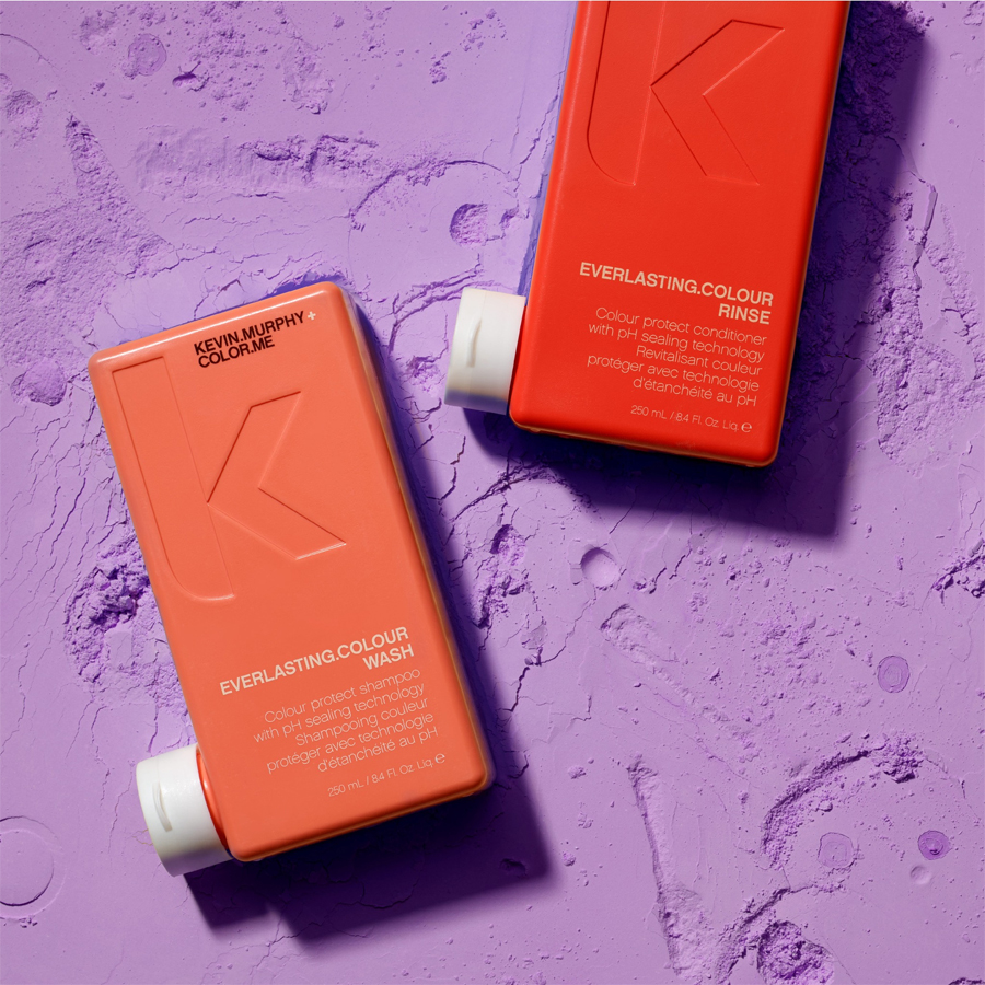
Colours are super important to create messages. Certain colours emit a specific feeling in people and this colour technology was certainly not overseen when it comes to stunning pieces e.g products from Kevin Murphy who seamlessly managed to match purpose with design. The idea of matching a soft pink, which is known as a gentle and sweet colour in the international colour wheel, matches perfectly with a hair mask that is meant to be used when you are showering yourself in self-love, for example.
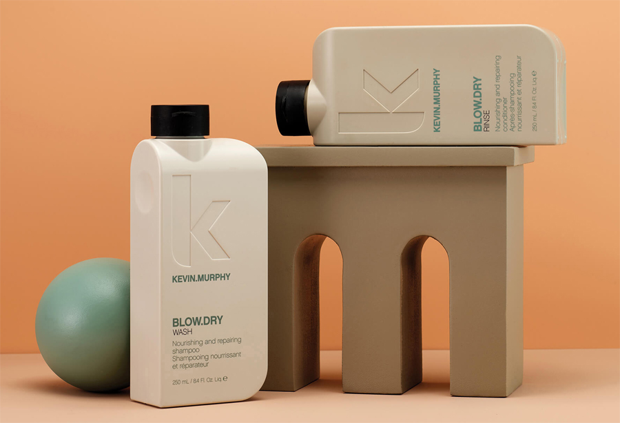
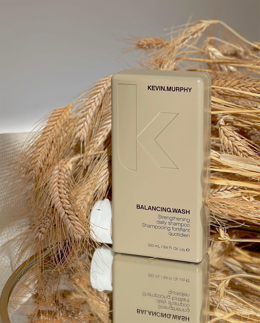
The colours of light greens, blues, peach and gold have paved the way for Australian packaging. These colours each offer a different feeling for the user but are all in line with Australian values. The green is meant to emit a freeing and fresh emotion, which is certainly something that the Australians advocate for. The blues are supposed to suggest the beauty of the ocean, the timeless landscape of the seas that seem to stretch to the end of the horizon and have led many water enthusiasts to the beautiful shores of Australia. Deep, light and turquoise blues are fan favourites and are meant to depict the love of the ocean.
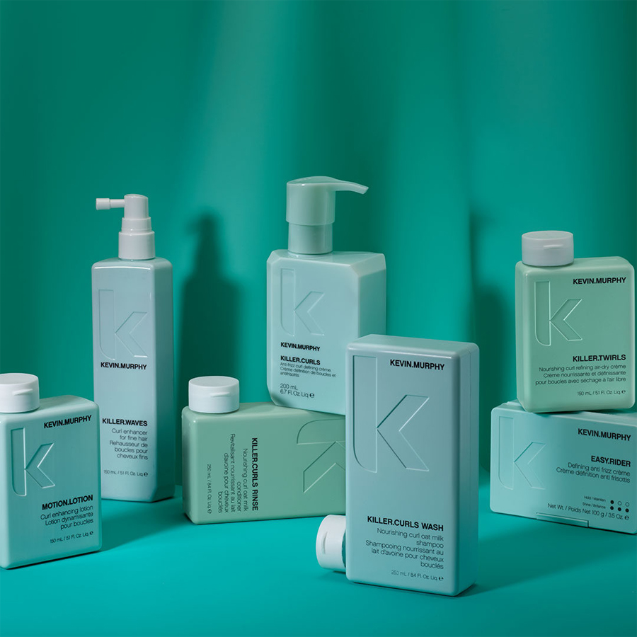
Many peachy colours are used as they indicate rosy cheeks and sunsets. The sun setting over the beaches in Australia is breathtaking. The idea of trying to mimic the beauty of a sunset into packaging might seem daunting but the Australians have done so majestically. There is one other colour that is extremely popular, especially for the lids of items and this is gold. This colour can communicate and represent so much. It is the golden glistening sand that lines the beaches but it can also be the mammoth boulders that can be found slightly deeper in the ocean. Gold also represents a goddess-like appearance, health and vitalisation. This is certainly something that the Australians stand for and something that their hair product packaging is meant to communicate.
A Conscious and Sustainable Approach
One aspect of design that is often overlooked but that is vitally important in today’s age is the sustainability that the product represents. Many Australian products have a strong ethos when it comes to the environment and the potential environmental impact that their products could have. Countless hours are often spent not only in creating the ideal product but also in establishing how to do so in a sustainable way. The way that Australian brands can create crisp-looking designs but make them interesting and useful to the consumer is truly inspiring.
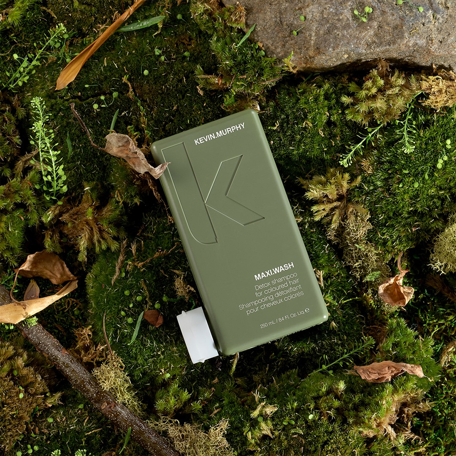
Many Australian hair products that are considered sustainable use packaging that is either recyclable or biodegradable. This massively reduces the carbon footprint of each of the brands that do so. Often, brands also spend a lot of time working on the content of each product to ensure that it is made with sustainability in mind. The aim is to make sure that every item within the packaging is made with only natural ingredients which were sourced from renewable or sustainable sources only. The goal at every turn is to ensure that the environment stays as clean and supreme as possible.
The Addition of Character
Each city, region and country is known to have its character. Certain people go as far as classing areas by just one word. New York is ‘go-getter’, London is ‘rainy’ and Australia is ‘expression’. This is not a science but it is interesting as these words are often found in packaging. If you look at the packaging of the classic New York style bagel, it’s often a simple piece of paper that is intended to be quickly ripped off – go-getter. If you think of the products that are popular in the United Kingdon, such as the famous biscuit tin, that is meant to be enjoyed with a steaming hot cup of tea you can understand how that suits the term ‘rainy’. When you think of Australia and the beauty of the people and the land, you think of true and honest expression. This comes into play in every regard, from notoriously enjoying the feeling of a bare foot and taking walking sticks into the outback for protection, freedom of expression is also found in the most delightful areas, such as the Australian hair product area.
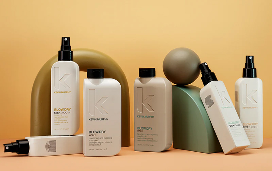
Many producers spend huge amounts of time investing in clever contraptions that allow the user to enjoy the product fully. If you think about a hair mask, you naturally want it in a tub-like shape so that you can easily dunk your hand inside and get a large quantity out. Much the same with a product that needs to be sprayed on, such as a shimmer oil. This is something you’d want to have in a spray bottle as opposed to a tub. Furthermore, if you’re looking to get away with a greasy scalp and need some powder to add to the top of your head, a small and compact item that you can squeeze and that has little holes inside to spread the powder would be much appreciated by the end user. You would think this is all obvious but many producers do not take the use of the product into account, which is not the case with Australian hair products who take extra care when it comes to packaging and have managed to merge the worlds of beauty, use and sustainability all into one.
